Mind the font: celebrating the man who gave London its letters
Londoners tend not to notice their daily exposure to one of the oldest and most enduring examples of brand identity. They're usually too concerned with avoiding eye contact with each other or getting their face stuck in someone's armpit while on public transport.
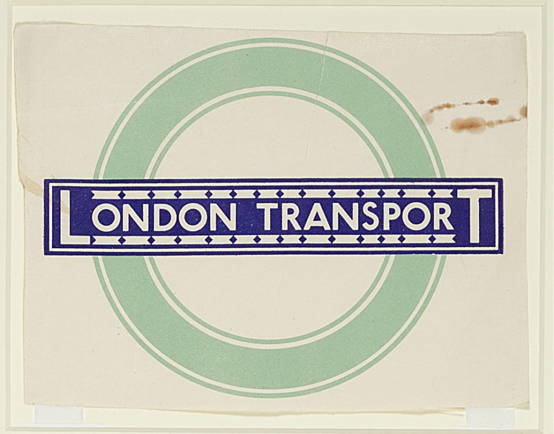
That branding is the lettering that is used on the bus signs, London Underground roundels, service boards, Tube maps and signs marking priority seating across the city's subterranean and above-ground transport system.
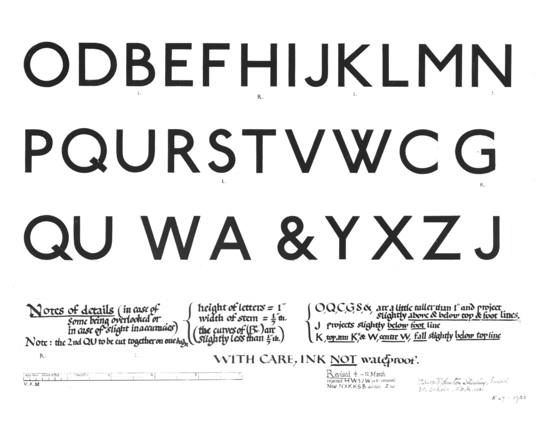
The diamonds above the letters 'i' and 'j', the curved boot of the 'I' and the uncompromising roundness of the 'o' might look as modern as a typeface invented in the digital era. But it was actually painstakingly drawn with a quill and carved out of wood 100 years ago.
It wasn't even designed by a typographer, and no brand manager was involved, yet Johnston Sans is easily recognised today as one of the most enduring visual identities ever developed.
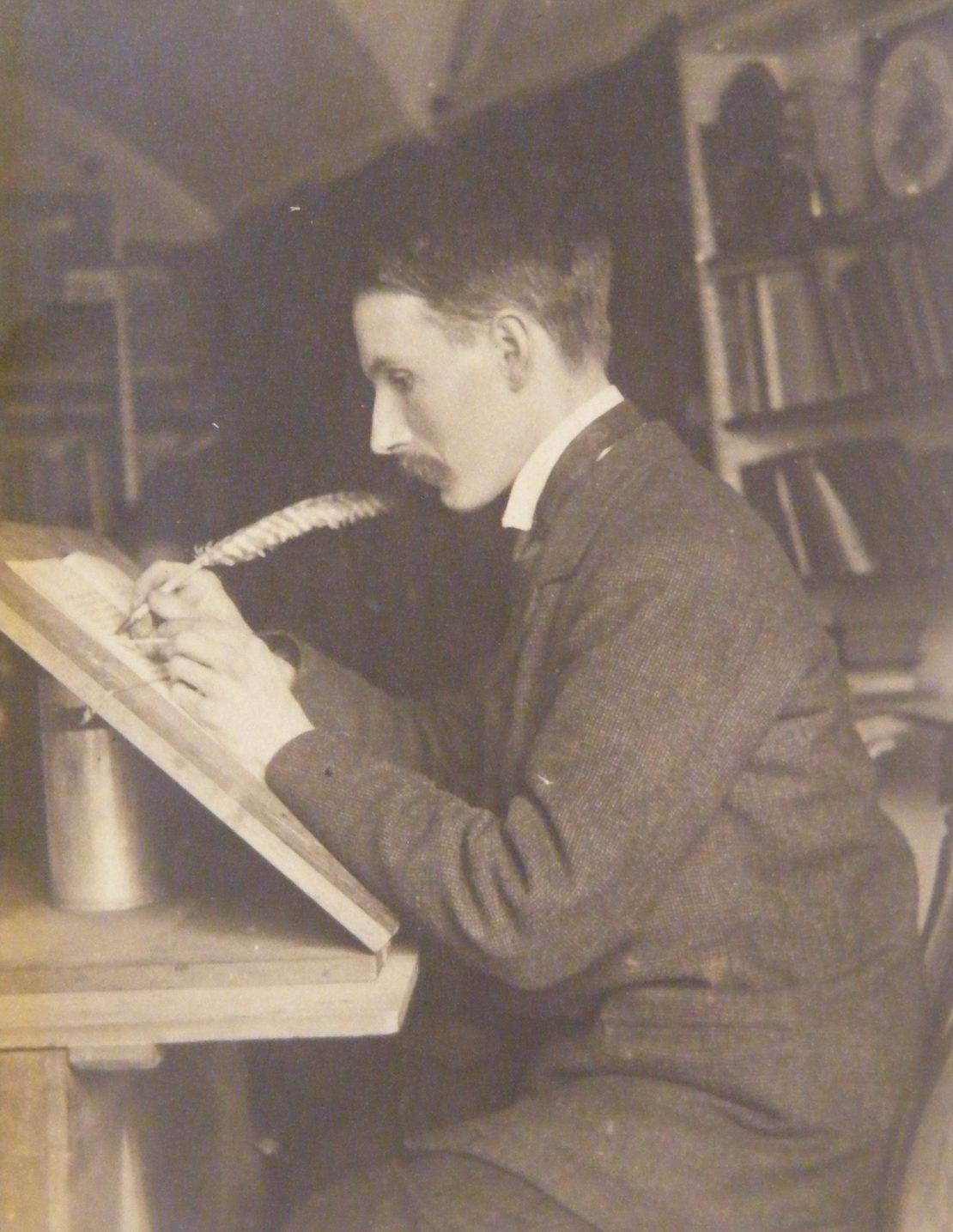
It was the work of calligrapher Edward Johnston, a medical school dropout who was seduced by the illuminated texts he saw in the British Library into jacking in his bid to become a doctor, instead pursuing the art of lettering.
The Johnston Sans typeface would become famous as Transport for London's visual voice – and would influence standardisations of transport systems around the world, although Johnston sadly died before the reach of his work was fully recognised.
Johnston's life – and his icon of metropolitanism – is now being celebrated with an exhibition at the Ditchling Museum in Sussex, in the rural village where he worked on the font a century ago.
The font is the copyrighted property of TfL, so you won’t see it anywhere else, although it does carry similarities to Gill Sans. Eric Gill was a student of Johnston's and assisted him on Johnston Sans for a short time at the project's beginning.
I imagine that Johnston Sans has a "Mind the gap" accent: not classically English, a bit Carry On film, but wholly distinctive
The brief given to Johnston in 1913 was to come up with a "manly" typeface that would not be mistaken for advertisements, containing the "bold simplicity of the authentic lettering of the finest periods", yet "unmistakably 20th-century".
In short, no twirly bits or serifs: the aesthetic flourishes on the feet or tips of letters.
Because Johnston was a calligrapher he didn't follow typographical rules about "correct spacing", instead making all the letters the same width.
Explore
The private painting of Eileen Gray Innovation heroes, #2: Gary Anderson Favourited: Electronic music – a blueprintIn a functional environment the clarity and legibility of his work is impossible to ignore. Yet it is the standardisation, its use on every facet of TfL material, that makes it as unmistakable as the voice shouting "Mind the gap" when the Tube doors open.
“We are bombarded with visual clutter all the time but Johnston Sans is a clear language which we recognise and don't have to think about,” says Sarah Hyndman, author of Why Fonts Matter.
”Johnston worked out a hundred years ago what new studies are only just telling us: that humanist sans serifs are more legible because they have curlier shapes. The 1s and ls don't look the same, which is very important in an information system.”
In Hyndman's book she describes fonts as if they have personalities, which of course they do, but she extends this into caricature describing Gill Sans, which is used by the BBC, as having a posh BBC broadcaster's voice.
“I also imagine that Johnston Sans has a "Mind the gap" accent: not classically English, a bit Carry On film, but wholly distinctive,” she says.
In the last hundred years Johnston Sans has only been officially amended once due to changes in print methods. In the 70s a Japanese typographer Eiichi Kono at British company Banks & Miles was asked to produce New Johnston – the version you see everywhere today. He completed this task in 1979 and succeeded in keeping the British brand as radical as ever despite first showcasing the fonts with the misspelling "Underglound".
Paul Wertheimer, a specialist in crowd-management strategies, observes that problems in transport systems "arise when signage is looked upon as a cost overhead, rather than for the valuable role it plays in effectively conveying information to the public in a timely manner."
The fact that in 1913, someone at the company which became TfL had the foresight to commission an artist and calligrapher to create a type representing the whole company plays a huge part in why it is still in use today.
Look out for the 'i's dotted with diamonds next time you travel.