Canned designs: Bold, brazen but never built in Pittsburgh

In 2016, entrepreneurs and designers of all stripes like to boast about their green credentials – even if those credentials can sometimes seem a little forced (London's proposed Garden Bridge, anyone?). But back in 1930s America, the environment wasn't exactly the number one concern anywhere. Frank Lloyd Wright was an architect who did care about nature, who wanted to realise some kind of accommodation between buildings and the natural world in which they sat. But he never quite found the sweet spot, and his architecture constantly pulled in opposing directions.

Did he hate the city? Probably. He certainly wanted to live out in the sun and the peace of Arizona, and his most famous building, Fallingwater, a house in the middle of nowhere, seems to effortlessly blend concrete with conifers, ribbed steel with rivers. He, like many Americans at that time, believed in the suburbs as the future and the car as the vehicle for that monumental social change.
All these contradictions and complexities came to a head in Wright’s most startling unrealised vision: an enormous civic centre for downtown Pittsburgh, a rough-and-ready steelmaking city.
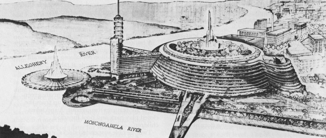
In the 1930s the city wanted to regenerate the wastelands at the meeting of its two rivers – a site of unparalleled natural beauty with hills overlooking the meeting of the waters, but one which had been scarred by industry. After World War II a victorious and confident America looked to a future where it could do anything. And it was from this optimism that, in 1947, Wright's Point Park plan emerged: a thumping megastructure right in the middle of Pittsburgh, set between the city's bridges. Towers would surround the main structure, which would house offices, leisure and entertainment venues, while a spiralling car ramp encased the building.
Wright's conflicts bubble to the surface: like in many of his visions there was a rooftop park, yet there was also roaring car traffic
The plan was commissioned by Edgar Kaufmann, a Pittsburgh retailer for whom Wright had built Fallingwater a hundred miles away. It was bold, brazen – but never built. A later Wright plan saw an altered vision – a tower, but no superstructure and a park instead. That too never took off. Instead, today there's a more modest park at the confluence point and various shops and offices around the edge of the site, but nothing as monumental as Wright suggested; though he probably would have liked the park.

In the original plan we see Wright's conflicts bubble to the surface: like in many of his visions there was a rooftop park (today's skyscrapers almost always feature 'sky gardens' and 'green roofs', indebted to FLW) yet there was also roaring car traffic on that ramp. It was a plan to reinvigorate a city yet it would have made the city noisy, smelly and unwalkable – and essentially easy to escape from by car. Most US city design from 1920 to 1990 was based on this premise of easy egress, to your suburban house many miles away.
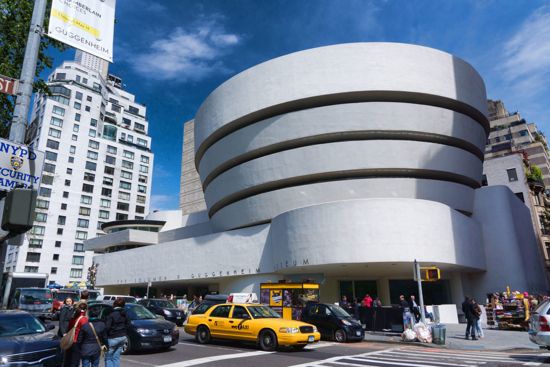
But Wight's vision didn't fade entirely, and the shape of the ramps on the superstructure lives on famously in something else we all know and love: New York's Guggenheim Museum, built in 1959. It looks like a veritable cake served at afternoon tea when compared to FLW's jarringly, crashingly modern Pittsburgh plan.
More in this series:
Canned designs: Rip it up and start again in Paris
Canned designs: Manhattan's doomed domed city
Canned designs: Cars on roofs in Staines
Canned designs: Berlin's paths not taken
Canned designs: Two sides of Glasgow
Canned designs: Tokyo's floating city