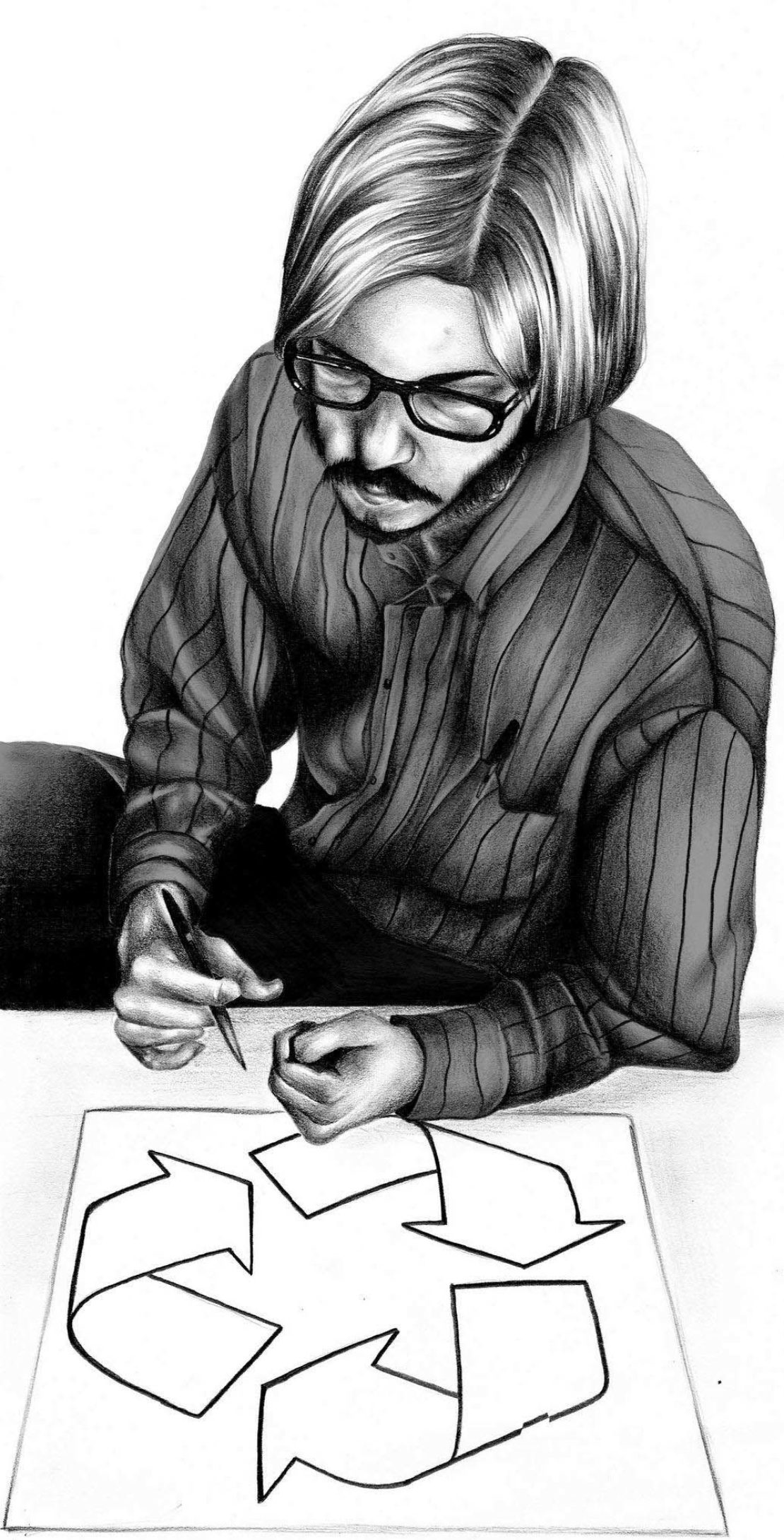
Innovation heroes, #2: Gary Anderson

The story
Back in 1970, the Container Corporation of America, a large cardboard manufacturer, held a student design contest to create a symbol representing the recycling process. The top prize went to Gary Anderson, a 23-year-old student at the University of Southern California. He won $2,500. But the logo went on to become one of the most globally recognised symbols there is.
How?
“I have often wondered why it caught on,” says Anderson. The CCA used it on millions of recycled products, and soon it was adopted by industry. Anderson puts its longevity down to it simply being first. “I like to think, though, that there is something about it that just somehow struck a chord with people.”
More in this series
Innovation heroes, #1: Larry TeslerAnd the design?
Anderson was inspired by the cyclic nature of a Möbius strip: the shape you get when you half-twist a strip of paper around on itself. It captured the idea of continuity within a finite entity, he says, 'static whilst dynamic'. But Anderson admits he knocked it out in an afternoon. “People keep trying to read things into it,” he says – like that the arrows stood for conserve, reuse, recycle. But that wasn’t the plan. “I ran across something on YouTube that claimed it was a satanic symbol – which also wasn’t my intention.” The CCA hardly changed the design, merely rotating it 30 degrees so it lay on a flat edge (Anderson says he designed it to look less stable).
And Anderson?
He used his prize money to fund further study in Stockholm, though he ended up pursuing architecture; today he works as an architect and planner for the US Army Medical Command. His role in the recycling movement now in its heyday hasn’t had much influence on him. “My own recycling habits can always stand improving,” he says.