Symbolic values
Currency signs don't necessarily just represent money. Some are the legacy of colonial empires; others fresh emblems of economic – and cultural – independence. While the origins of some symbols are lost in the mists of time, others are carefully designed to reflect a nation's hopes and the stories a country tells about itself. The arrival of the euro in 2002 removed much diversity from our currency signage. But new symbols are conceived all the time – each arrival a new nightmare for computer programmers.
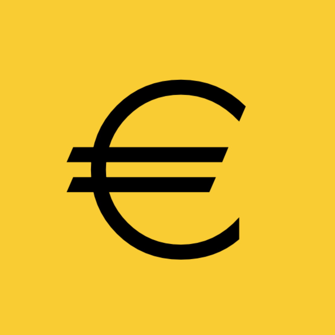
It was way back in 1996 that the new euro sign was announced – replacing 22 currencies' symbols, including the Dutch guilder (ƒ), Portuguese escudo ($), and Vatican lira (₤). According to the European Commission, inspiration came from the Greek letter epsilon (ϵ): a reference to the 'cradle of European civilisation'. Ironically, in the light of the ongoing eurozone crisis, the parallel lines were meant to evoke stability. The Commission has never revealed who actually designed the symbol. Others have taken inspiration too: the new Azerbaijani manat symbol, unveiled in 2006, is effectively a single-bar euro sign rotated 90 degrees.

Although the lari had been the currency of Georgia since 1995 (replacing the kuponi and, before that, the Russian rouble), it was not until 2014 that this elaborate new symbol was announced following a public competition. The design is by artist-ceramicist Malkhaz Shvelidze and is based on the Geogian letter lasi (ლ). The addition of vertical lines is a classic way to convert an ordinary letter into a currency symbol. Other examples include Bitcoin (฿) and, of course, the US dollar ($).
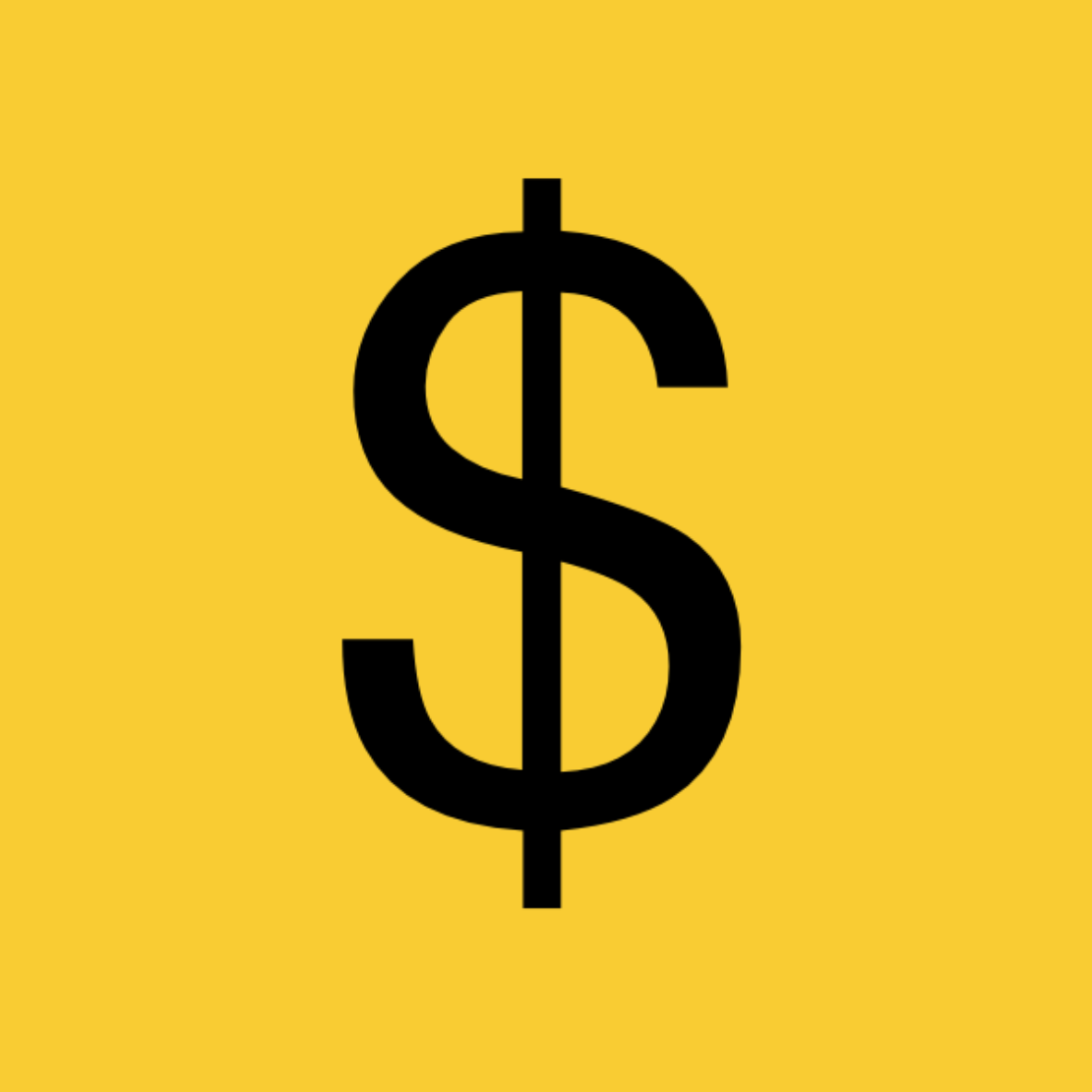
The original US dollar was based on the Spanish dollar, or real de a ocho, a silver coin worth eight reales (hence pieces of eight), in circulation across the Spanish Empire from 1598 onwards. Intriguingly, nobody knows for sure the exact origin of today's $ sign. It's probably a scribal abbreviation of 'ps' (pesos), but could also be derived from the superimposed 'PTSI' mint mark on the pieces of eight. Alternative origin hypotheses include the staff of Hermes, the Spanish coat of arms, or simply the letters 'US' printed on top of each other.
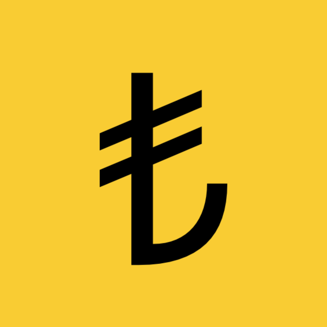
If dollar-inspired vertical lines are relatively common, horizontal lines (either single or double) are even more popular. Examples include the Armenian dram (), the Laotian kip (₭), the Nigerian naira (₦), the Philippine peso (₱), the Russian rouble (
), the North Korean won (₩), and Japanese yen (¥). The parallel lines of the Turkish lira, however, are set rather rakishly at an angle of 20 degrees. The symbol was designed in 2012 by Tülay Lale and features the letter L-shaped like a half-anchor.

Possibly the most distinctive currency sign in the world, this symbol for the Israeli new shekel was officially announced in 1985 when the new currency was launched. It is formed from the first and last letters of ש״ח – the Hebrew acronym for the currency. It may not look much like any other currency symbol but, like the $ sign, it is rotationally symmetrical.
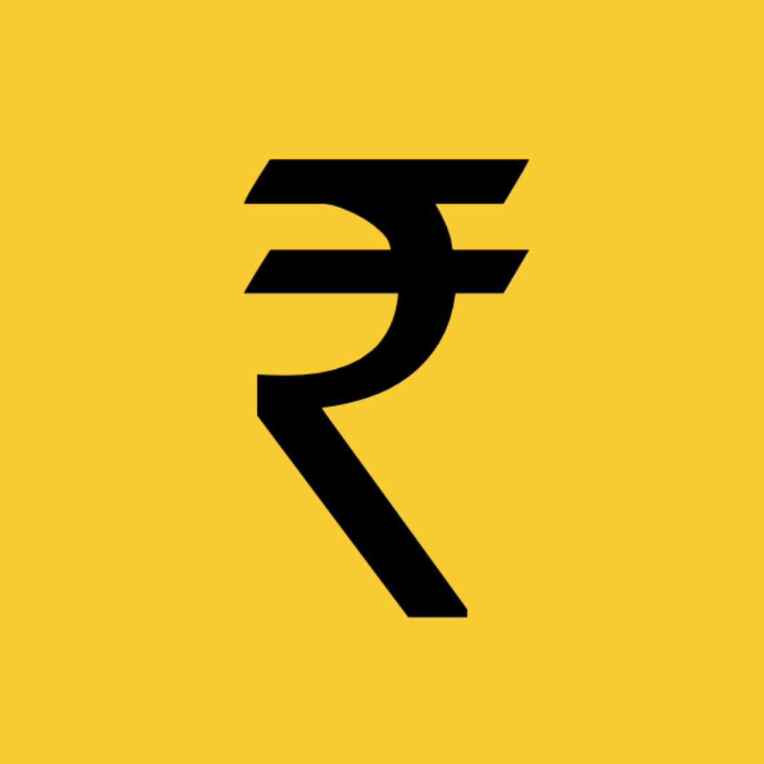
In 2009, the Indian government announced a contest to create a new sign for the Indian rupee. The new symbol, designed by Udaya Kumar, academic and designer, is a stylised combination of a Latin R and the Devanagari letter र (ra). While the double lines in the euro and the Ukranian hryvnia symbolise stability, in the Indian rupee they reflect the Indian tricolour and a desire for economic equality.
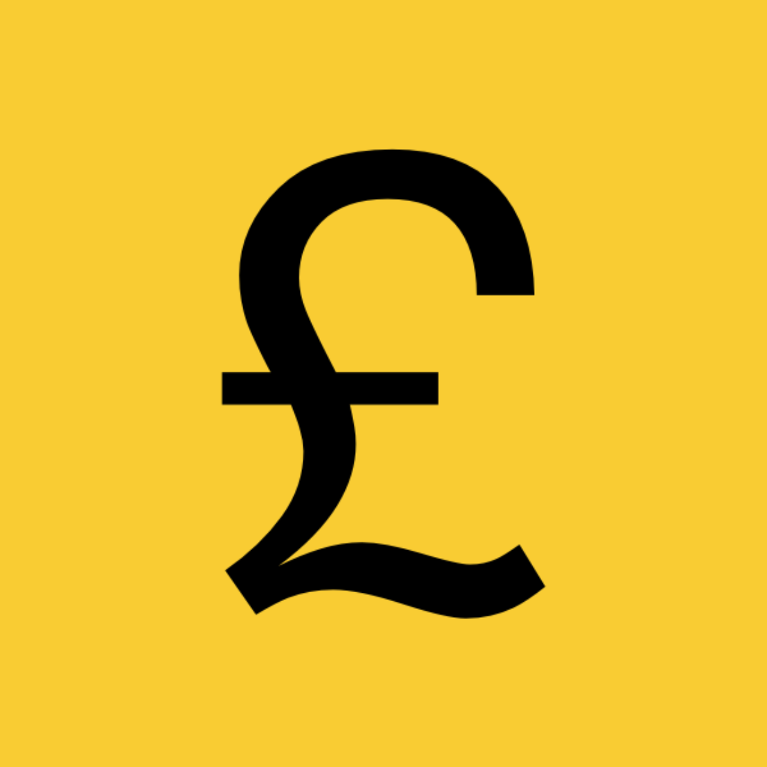
The fashion for horizontal lines is most likely influenced by the British pound sign. The pound sterling is the world's oldest continuously used currency. As the name suggests, it was originally equivalent to one pound weight of silver – 240 Anglo-Saxon silver pennies. The symbol is derived from the capital L of the Latin word libra, the basic Roman unit of weight and also the scales used to measure it. Hence the sign of the zodiac – and, indeed, the ancient link between currency symbols and ideas of balance, stability, equality, and even justice.